Building a Scalable Brand System for Order.co
BRANDING | 2022-PRESENT
Order.co’s original brand identity, developed by creative agency GrandArmy in 2022, had a strong visual impact. However, as the company scaled, there was a growing need to refine, simplify, and own the system internally. Since 2023, I have led the effort to evolve the brand into a flexible, accessible, and consistent identity that better serves marketing, product, and internal teams.
My role:
Lead Designer & Brand Strategist
In collaboration with Marketing, Product, and Executive stakeholders
Responsible for end-to-end brand system audit, redesign, documentation, and rollout
The challenge:
The original GrandArmy brand was expressive and visually rich, but it also:
Relied on a wide, often subjective color palette
Lacked scalable documentation for internal or cross-functional teams
Had no codified brand voice
Included experimental elements that became difficult to translate into product or marketing assets
As Order.co grew, it needed a brand system that was:
Consistent across channels
Scalable for internal use
ADA-compliant and UI-friendly
Reflective of the brand’s evolving tone
What got updated:
Logo System
Simplified to four approved variants (Avocado, Dark Avocado, White, Lime)
Introduced clear guidelines for usage, spacing, and misuse
Removed alternate/animated logos for better consistency
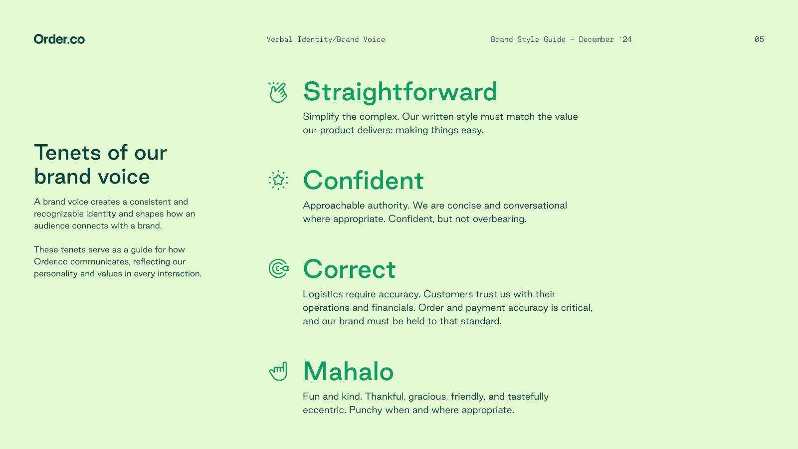
Verbal Identity
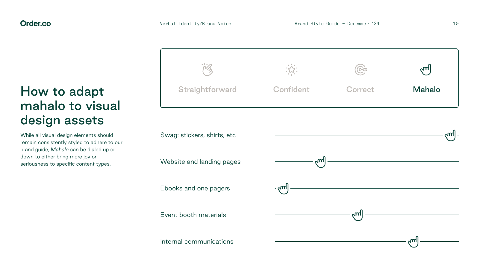
Introduced a brand voice framework based on four tenets:
Straightforward, Confident, Correct, and Mahalo (our term for warmth and gratitude)
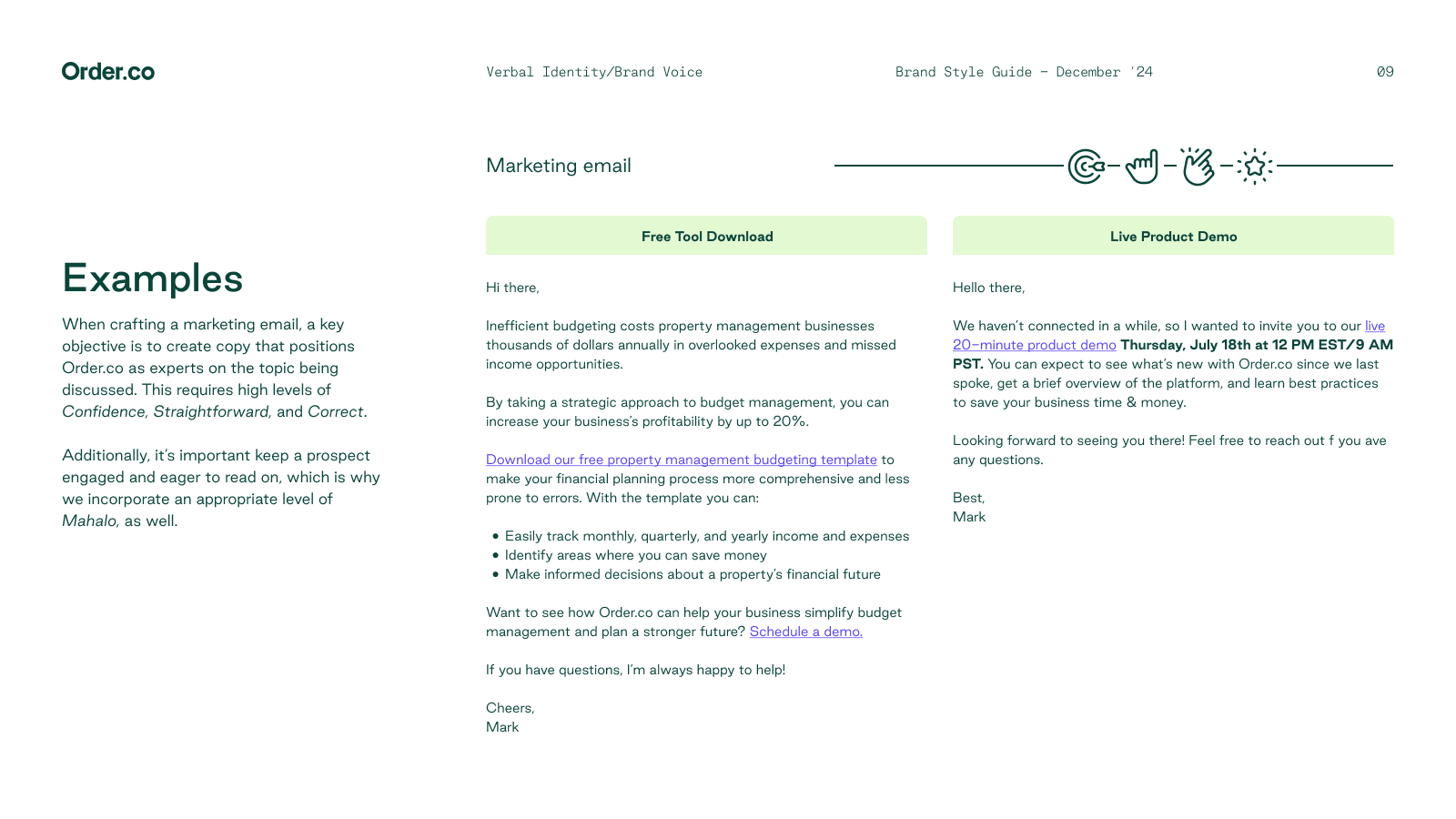
Applied voice guidelines to marketing, product, and support content
Provided real-world examples (emails, alerts, help center copy)
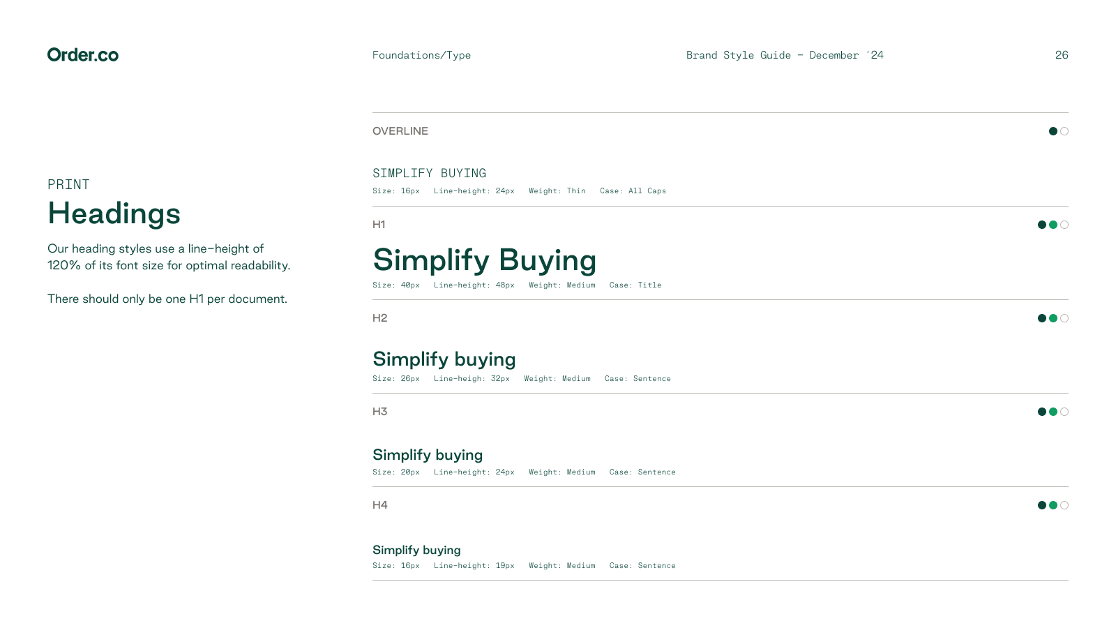
Typography
Replaced expressive editorial fonts with modern, web-safe families:
Good Sans (primary), Good Mono (labels), with fallbacks for open-source use
Defined full type hierarchy for web and print (H1–H4, paragraph, caption)
Included size, weight, case, and spacing specs for accessibility and consistency
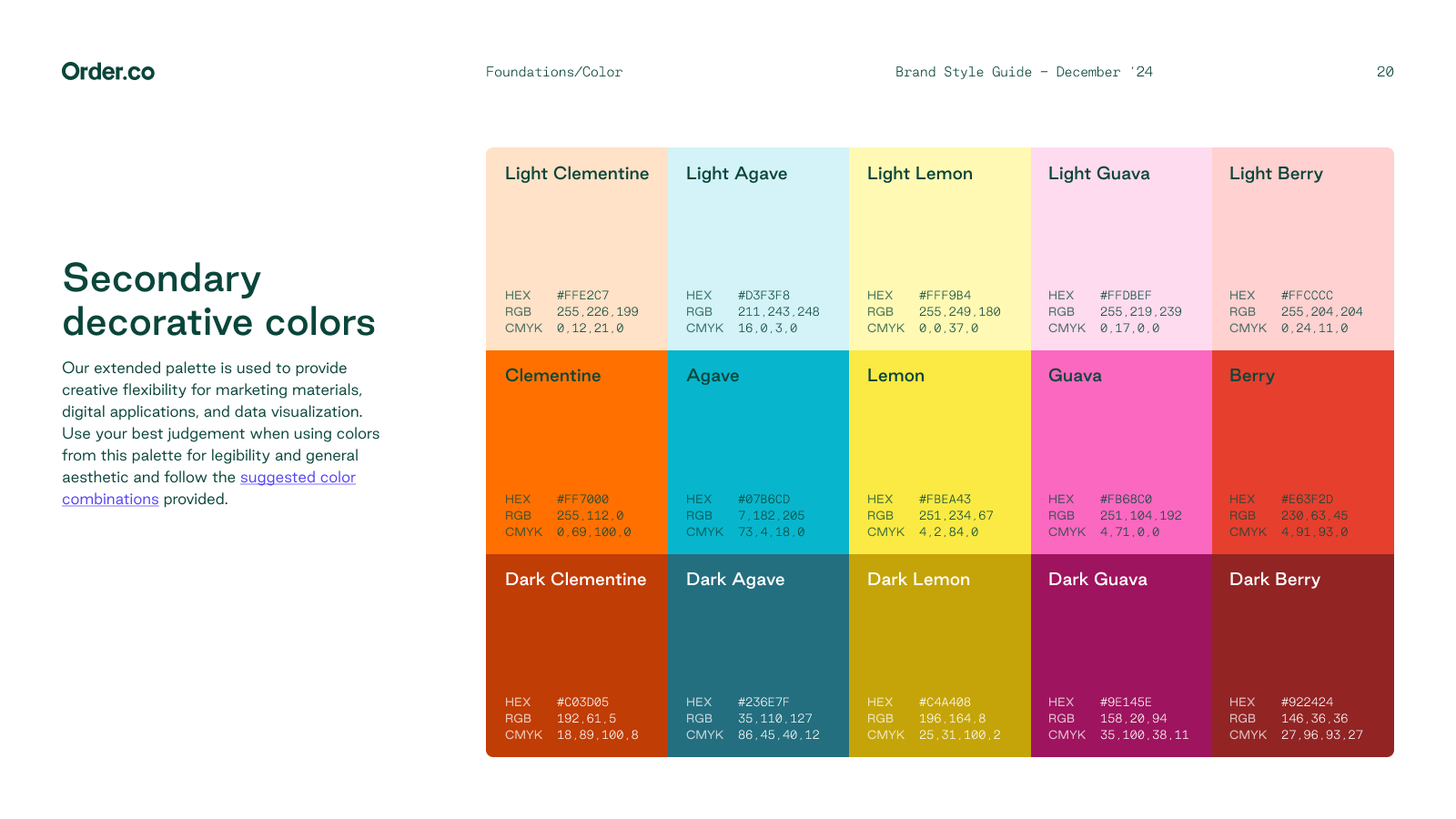
Color Palette
Rationalized the palette down to core and decorative colors
Defined approved primary and secondary color pairings
Established accessibility levels (AA/AAA) for digital applications
Created guidance for how to use color in UI, marketing, and data viz
Iconography
Created a standardized icon library with pixel-based sizing (16–48px)
Defined brand color usage by background type
Provided access to shared asset library for internal teams
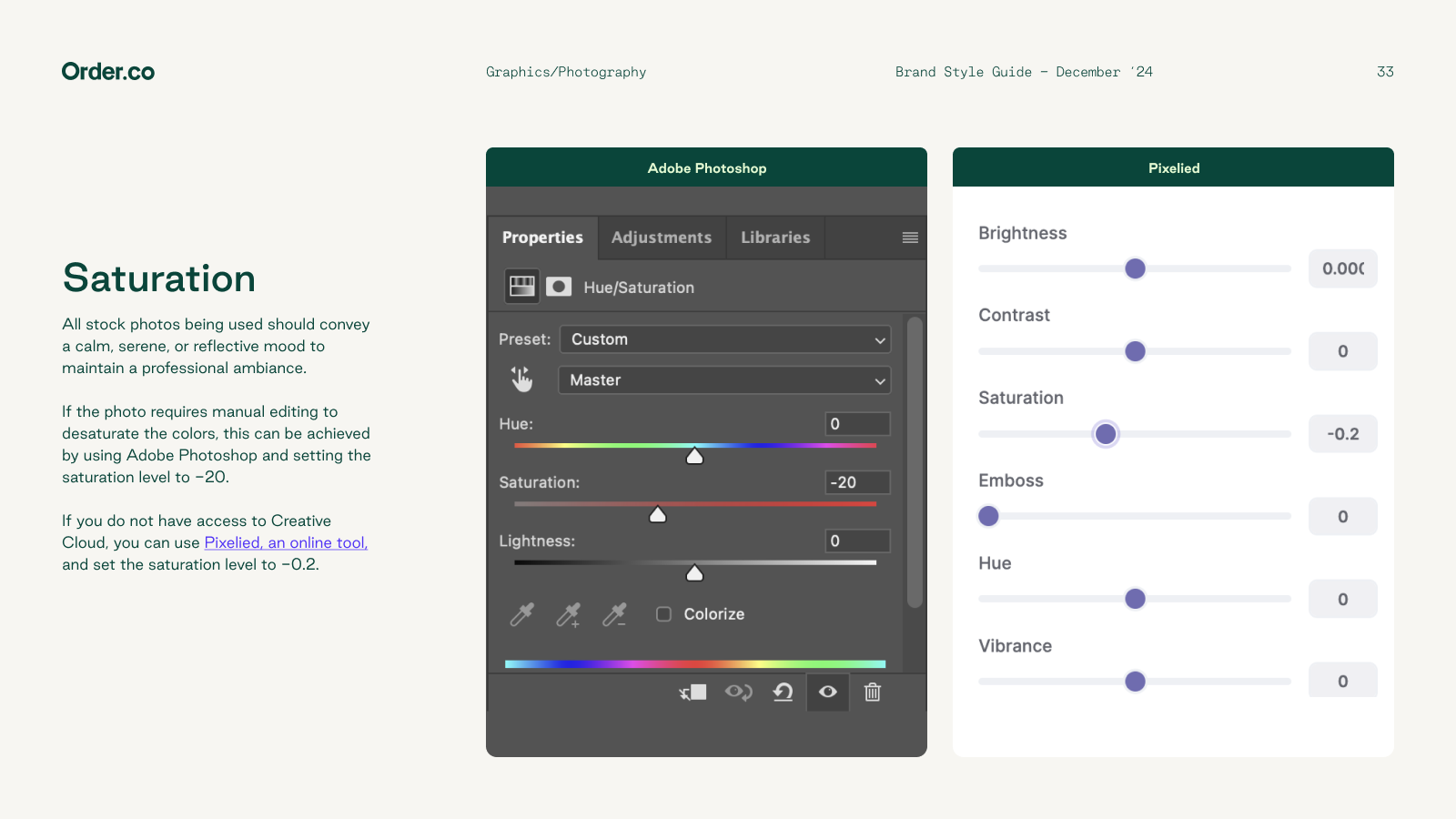
Photography
Shifted to authentic, inclusive imagery with slight desaturation
Outlined visual tone (calm, clear, human) and saturation rules for consistency
Defined do’s/don’ts for selecting or editing stock photos
Results:
1. A fully documented and scalable brand guide
2. Cross-functional alignment on voice and visual standards
3. Faster turnaround for new assets, campaigns, and product screens
4. A brand that now feels as streamlined and reliable as the platform itself


