A Refreshed Brand Guide for PlaceIQ To Meet New Business Needs
BRANDING | 2021-2022
An overhaul of PlaceIQ’s brand system to enhance visual cohesion, elevate data visualization, and reinforce its leadership in real-world location analytics.
As PlaceIQ scaled its analytic capabilities, the existing brand lacked the visual system to support increasingly complex data and product interfaces. I led a brand identity refresh that zeroed in on improving consistency, readability, and strategic alignment across all touchpoints—from iconography and UI elements to photography and data visualization styling.
The refreshed brand guide better supported cross-functional adoption, which enabled the marketing, product, and analytics teams to deliver with speed and consistency.
What got updated:
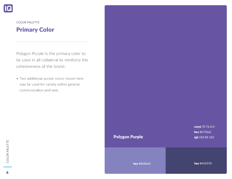
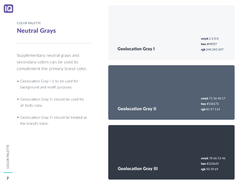
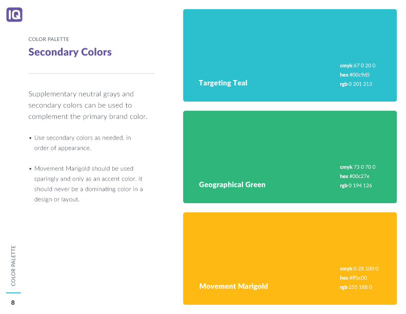
Expanded Color Palette
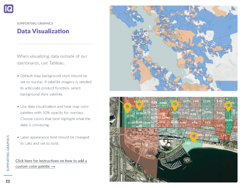
Refined the secondary palette and grayscale tones to support complex data visualizations and maintain contrast across charts, dashboards, and marketing assets
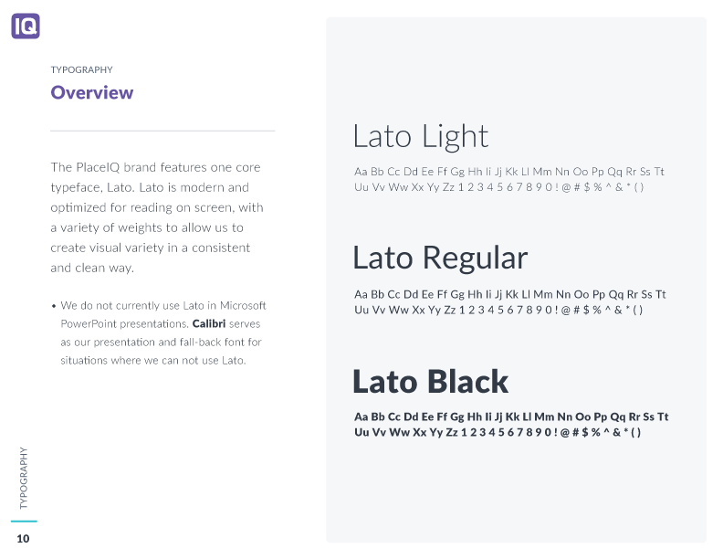
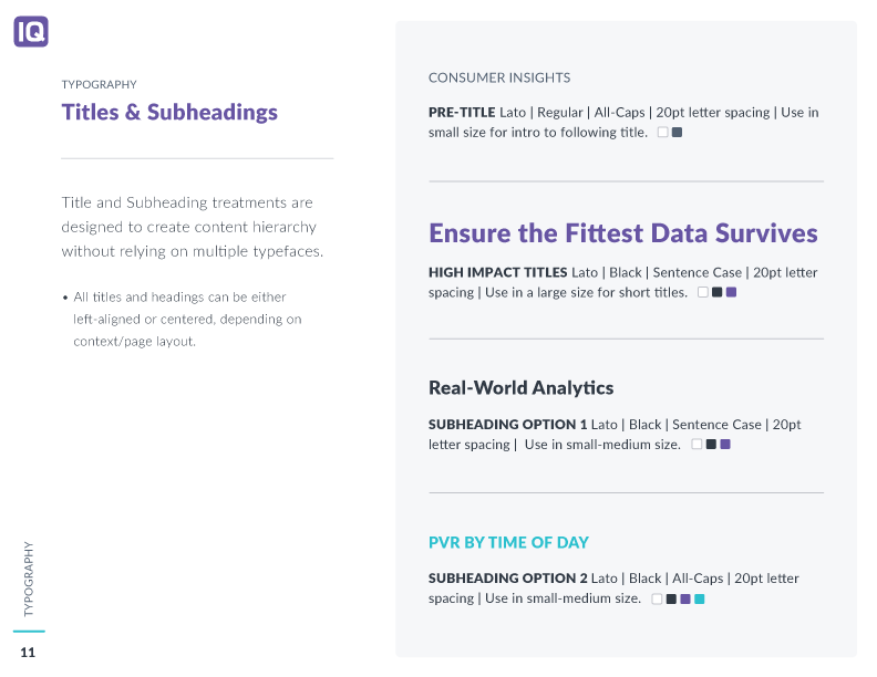
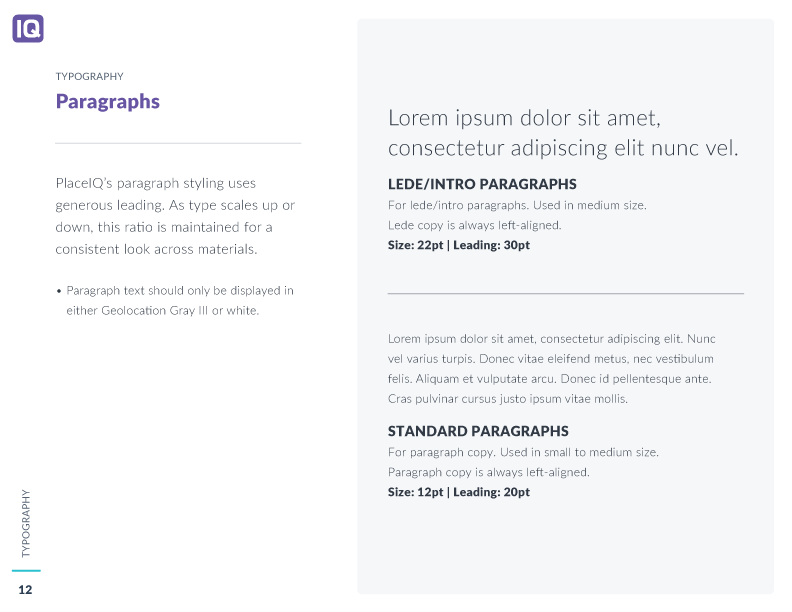
Typography
Introduced a type system that enhanced legibility and established a defined hierarchy for headings, body text, and data labels across both digital and print assets
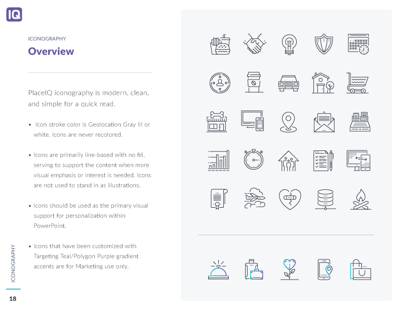
Iconography
Redesigned the icon set with custom embellishments to add character and reinforce PlaceIQ’s brand identity
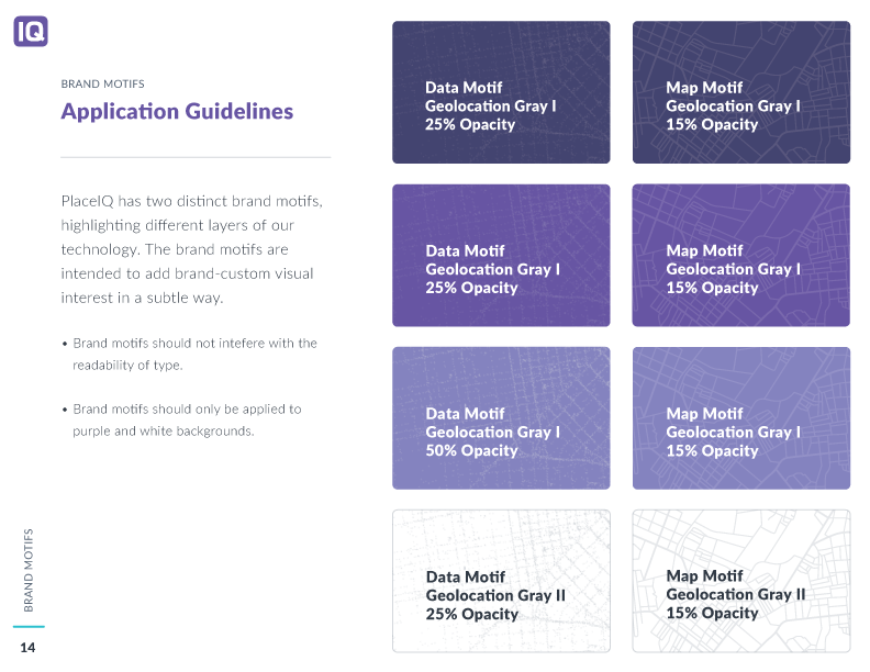
Map Motif Creation
Created a signature map motif inspired by PlaceIQ’s geographic intelligence, with usage guidelines for scalable implementation
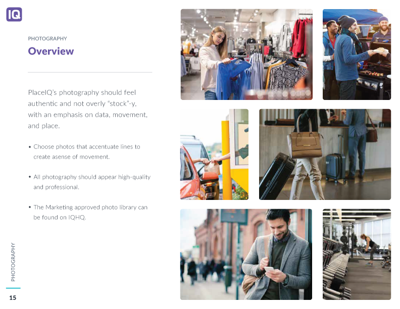
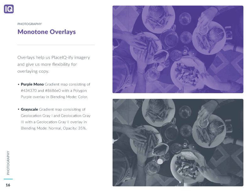
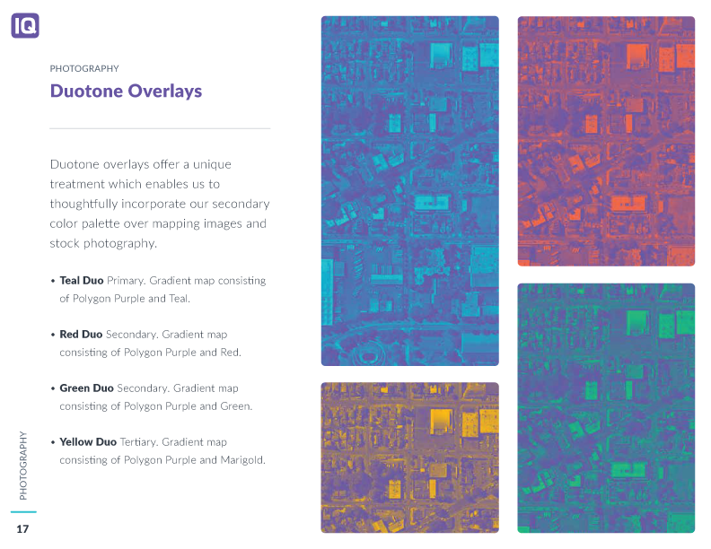
Photography Guidelines
Curated stock photo examples to highlight PlaceIQ’s technology and real-world applications, with guidance on applying monotone and duotone overlays
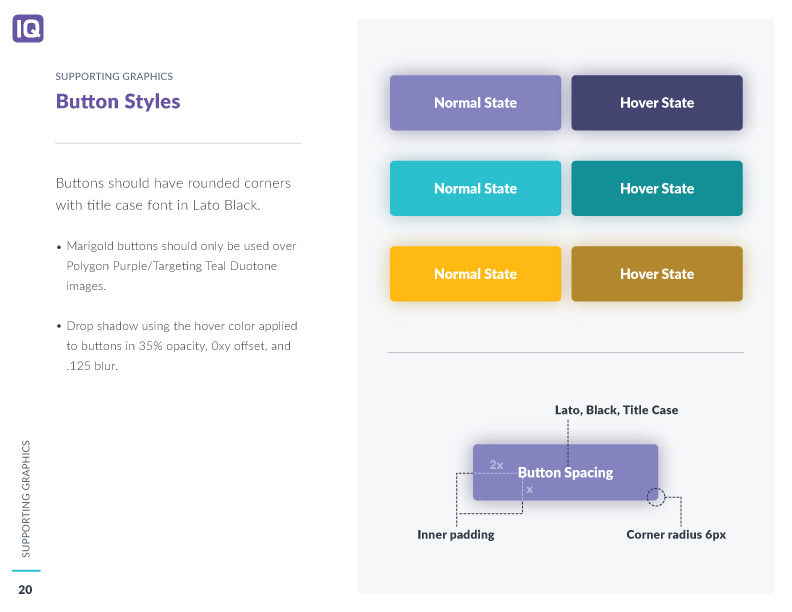
Enhanced UI Elements
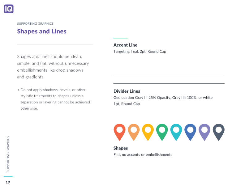
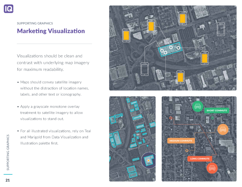
Established industry standard button styles and created comprehensive rules for marketing illustrations and data visualizations